

Every advertiser eventually wants to say "we're better than the alternative" without the legal and reputational mess of putting a specific competitor's name in the creative. Academic research on comparative advertising going back decades backs the instinct that comparison sells: a meta-analysis cited in the Journal of Business Research's 2020 review of comparative-advertising literature found that comparison ads consistently outperform non-comparative ads on cognitive measures like attention, recall, and purchase intention, even as results on brand attitude and likability stay mixed.
Ad Studio's generate_image_preset_agent now ships a comparison-vs preset that builds exactly this structure into a single generated image: your product against an alternative, point by point, with the alternative framed generically instead of named.
Why comparison works even without naming a competitor
The mechanism behind comparative advertising isn't really about tearing down a specific rival. It's about giving the brain a reference point. A 2022 peer-reviewed study published in Frontiers in Psychology found that comparative advertising raises purchase intention primarily because it increases perceived diagnosticity of information: when a product is shown against an alternative, a shopper can actually evaluate the claim being made instead of taking a bare assertion on faith. The same study found this effect holds up strongly for self-interested, practical appeals, and weakens for emotionally altruistic ones, which matters for how this preset should be briefed.
None of that requires naming "Brand X." A generic alternative, the old way of doing something, a typical product in the category, a before-this-existed baseline, gives the same diagnostic contrast without the legal exposure or the free publicity for an actual rival. That's the version of comparison advertising this preset is built for.
What the comparison-vs preset actually does
generate_image_preset_agent's comparison-vs preset takes a product photo and a specific, factual point of difference, then composes a single image holding both sides of the comparison at once: your product on one side, a generic alternative or category baseline on the other, structured around the actual attribute being contrasted (speed, mess, cost, a visible defect the alternative has that yours doesn't). The model handles the layout and visual balance between the two sides. The advertiser supplies the actual point of comparison, and it has to be a real, checkable difference, not an invented one.
This is the same substantiation discipline every preset in this family runs into eventually, and it's sharper here than almost anywhere else in the enum. A comparison claim that can't survive a customer actually checking it is the fastest way to turn a persuasive format into a credibility problem. The 2020 Journal of Business Research review of comparative-advertising research also flags this directly: comparative ads perform worse than non-comparative ads on informativeness, counterarguing, and source credibility when the comparison reads as flimsy or self-serving. The format only pays off when the point of contrast is specific and true.

It sits next to its siblings in this family without repeating any of them. The social-proof preset borrows credibility from someone else's words. The statistics-data preset borrows credibility from a cited number. The problem-solution preset borrows urgency from a frustration the reader already recognizes. The knolling preset borrows clarity from showing everything in a set at once. The comparison-vs preset borrows persuasion from contrast itself, the one lever in this family that works by putting two things side by side and letting the difference do the talking.
Worked example: building a comparison without naming a rival
Start with a product photo and one real, specific, factual point of difference, something the product actually does better than a generic version of the category, not an embellished or unverifiable claim. The brief for the preset:
Preset: comparison-vs
Product: [product photo URL or productId]
Alternative: [a generic category baseline, "the old way," "a typical version," never a named competing brand]
Point of difference: [the exact, specific, factual attribute being contrasted, written out literally, e.g. "dries in 10 minutes instead of overnight"]
Style direction: hold both sides in one composition, split clearly enough that the contrast reads instantly, no invented secondary claim, no named competitor anywhere in the prompt or the rendered text
Avoid: a vague or unverifiable superiority claim, garbled on-image text, any real brand name or logo standing in for "the alternative"
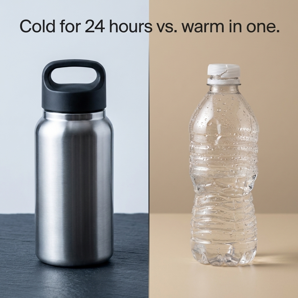
This is a real generate_image_preset_agent render, preset comparison-vs, fired against a demo product photo with the exact prompt above. The output composed the named point of difference into a clear side-by-side frame with the product as the stronger half, confirmed on inspection before publishing.
The one rule that makes or breaks this format
Never let "the alternative" become a specific, identifiable brand, logo, or product you can point to by name, even accidentally. That's not just an editorial preference, it's the exact line SOUL.md's pure-performance doctrine draws for every article on this blog: the subject has to be what the reader can make on Coinis, never a competing product, named or implied closely enough to be recognizable. A generic baseline keeps the comparison legally and reputationally simple while still giving the format's full persuasive power, since the diagnosticity effect the research describes comes from the contrast structure itself, not from which specific rival is named.
The second rule sits right behind it: the point of difference has to be real and specific enough that a customer who buys the product can verify it themselves. "Better" is not a point of difference. "Dries in 10 minutes instead of overnight" is. Pull it from an actual product spec, not a hopeful adjective.
FAQ
Can I name a real competitor in the comparison? Don't. This preset is built and documented here for a generic-alternative framing. Naming a specific competing brand turns a product-ad format into a comparative-advertising legal question this guide isn't equipped to answer, and it risks sending attention toward a rival's product instead of your own.
Does the preset verify my comparison claim? No. The preset only composes whatever point of difference it's given. Confirming that the claim is real, specific, and something the product actually delivers is the advertiser's job before the prompt is written, the same discipline every preset in this family depends on.
How is this different from the problem-solution preset? Problem-solution frames one product against the frustration it resolves. Comparison-vs frames one product directly against an alternative approach or baseline. The mechanics overlap in spirit, both use contrast, but comparison-vs makes the "other side" an explicit visual presence in the frame rather than an implied prior state.
What kind of point of difference works best? A single, concrete, checkable attribute: speed, a visible defect the alternative has, a cost difference, an included feature the baseline lacks. Pick one. Trying to cram three points of difference into one image usually reads as cluttered rather than persuasive.
Can I test this against a non-comparison format? Yes, and it's worth doing before committing spend to either lever alone. Run a comparison-vs variant against a problem-solution or statistics-data variant of the same product to see which structure actually moves a given audience, rather than assuming contrast always wins just because the research leans that way on average.
Try it on Coinis
Pick one real, specific point of difference your product actually has over a typical alternative, generic, unnamed, impossible to mistake for an attack on a competitor, and let the contrast do the persuading instead of another adjective-heavy headline.
Start building comparison creative on Coinis
Sources
- del Barrio-García, Salvador, Francisco Muñoz-Leiva, and Linda Golden, "A review of comparative advertising research 1975-2018: Thematic and citation analyses," Journal of Business Research 121 (2020): 73-84, summarizing Grewal et al.'s 1997 meta-analysis on comparative vs. non-comparative advertising effectiveness: https://www.sciencedirect.com/science/article/abs/pii/S0148296320305336
- Ni, Kuocheng, Yanfeng Lin, Shenghong Ye, Zhiheng Lin, and Yunxiao Liu, "Using strengths to attack weaknesses: The effect of comparative advertising on purchasing intention of green products," Frontiers in Psychology 13 (2022): 1051856, open access, CC BY: https://pmc.ncbi.nlm.nih.gov/articles/PMC9687388/

Isidora Matovic
Author
Social media enthusiast and a full time researcher. She takes digital presence very seriously and that is why you are always in touch in what is going on with us! Follow us for more posts like this.