
A lipstick called Dusty Rose has to look like dusty rose. Not a shade warmer, not a shade cooler. The moment a phone photo shot under warm indoor light shifts that shade even slightly orange, the ad built from it is selling a color the product doesn't actually have.
Most performance-marketing advice treats a product photo as a container for the ad, something to crop, resize, and drop a headline over. In beauty and cosmetics, the photo carries more weight than that. It carries the sale itself. A customer buying a foundation or a lip color is buying a specific, exact shade, and the photo is the only place they can check it before the box arrives.
Why this defect is worse in beauty than almost anywhere else
Every product category has a version of "the photo didn't match reality." In apparel it's the drape of a fabric. In electronics it's a spec sheet. In beauty and cosmetics, it's color, and color is not a secondary attribute of the product. It is the product.
A peer-reviewed study in the European Journal of Marketing (Nitse, Parker, Krumwiede, and Ottaway, "The Impact of Color in the E-Commerce Marketing of Fashions: An Exploratory Study," Vol. 38 No. 7, 2004, pp. 898-915) surveyed online shoppers specifically about color-inaccurate product photos and found that inaccurate colors drive real, measurable business damage: lost sales, higher return rates, more customer-service complaints, and outright customer defections. A majority of the respondents in that study said they would stop buying from a retailer entirely after receiving an item in a color that didn't match what they saw online. That's not a one-time refund. That's a customer gone for good, over a lighting problem in a photo.
The scale of the underlying returns problem backs this up. The National Retail Federation and Happy Returns put total US retail returns at roughly $890 billion in 2024, and a well-documented share of that traces back to the product simply not looking like its photo (NRF and Happy Returns, "2024 Consumer Returns in the Retail Industry," December 5, 2024). Beauty and cosmetics sit at a lower overall return rate than apparel, but the single biggest driver inside that category is a shade that didn't match what the customer expected from the listing photo.
The two ways beauty photography drifts off true color
Warm indoor light (the kind most small brands shoot under, whether that's a kitchen counter or a warehouse under fluorescent tubes) pushes every color toward orange and yellow. A cool, overcast window light pushes the other way, toward blue. Neither is a dramatic, obviously-wrong shift. It's subtle enough that the person who shot the photo doesn't notice it on their own screen, calibrated or not, and different customer screens then compound the drift in different directions on top of whatever the source photo already carries.
That subtlety is exactly the problem. A wildly wrong photo gets caught and reshot. A photo that's ten percent too warm ships as-is, looks fine in isolation, and only becomes visible the moment a customer holds the physical product next to their screen and asks why the lipstick in their hand isn't the color they ordered.
Fix the source photo before it becomes six ad variants
Ad Studio's enhance_asset_proxy tool exists for exactly this repair step, and color and white-balance correction is one of its documented operations alongside sharpening, denoising, background swaps, and object removal. The tool takes the source imageUrl, a model selection matched to the actual flaw, and any op-specific parameters that operation documents, nothing more. For a shade-shifted cosmetics photo, that means correcting the color temperature back toward neutral before the photo goes anywhere near a generation preset.
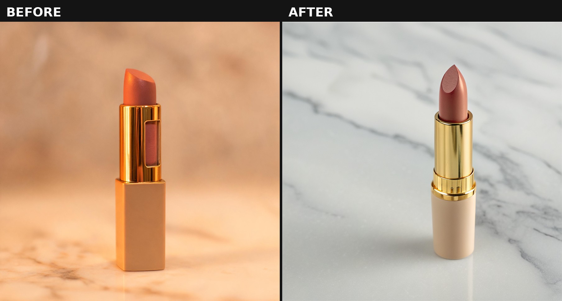
Real enhance_asset_proxy correction (recraft-inpaint, full-frame color/white-balance pass): the lipstick's true dusty rose shade recovered from an orange-shifted warm-light source photo.
Once the color is corrected, the fan-out step is generate_image_templates, the same tool that already turns one clean product photo into a full set of ad sizes. The correction only needs to happen once. Every square, story, and banner variant generated from that corrected file inherits the true shade instead of carrying the same color drift into every format and platform.

Real generate_image_templates fan-out from the corrected photo: square, story, and landscape banner, same true shade in every format.
Why fixing this after the fact doesn't work
A brand that notices the color problem only after a return spike is already paying twice. Once in the return itself, once in whatever ad spend brought that now-disappointed customer to the site in the first place. And the fix at that point usually means a full reshoot, not a five-minute correction pass, because nobody flagged the color drift before the photo went into a hundred ad variants across platforms and markets.
This is also why the correction has to happen before the fan-out, not after. Running a shade-shifted photo through resize and localization or a cinematic product preset doesn't fix the color, it just multiplies it. The same discipline that already applies to fixing creative fatigue (documented in mobile game ad creative fatigue: fix the underlying asset, not each downstream symptom) applies here. Correct the one file everything else is built from, and every variant downstream is correct by inheritance.
Building this into a beauty brand's launch checklist
Before a cosmetics product photo goes into any ad-generation preset, ask one question: does this photo's color genuinely match the physical product under neutral light? Not "does it look fine on my screen," because that's exactly the trap the study above documents. If there's any visible warmth or coolness pulling the shade off true, that's an enhance_asset_proxy color-correction job before it's anything else.
For a brand running its own ad account without a dedicated photo studio and color-calibrated monitors, this two-step order (correct the color, then generate the full ad set) is the difference between a launch-ready campaign and a return-rate problem that shows up three weeks later as a spike in customer-service tickets asking why the shade doesn't match.
FAQ
Does correcting the color cast change the product itself, the actual formula or shade? No. The correction fixes how the existing photo represents the product's true color under the lighting it was shot in. The product, the formula, and the actual shade never change. What changes is whether the photo tells the truth about them.
How is this different from a generic "enhance my photo" pass? A generic enhance pass might sharpen or brighten a photo without addressing whether the color itself is accurate. Color and white-balance correction is a specific, targeted operation aimed at one thing: does the shade in the photo match the shade of the physical product. That's a narrower and more precise fix than a blanket enhancement.
What if the photo has more than one problem, like a color cast and a cluttered background? enhance_asset_proxy handles color correction, background swaps, sharpening, and denoising as separate operations on the same surface, so a photo with more than one flaw can go through the repair chain more than once, once per actual problem, before it reaches the generation step.
Does this replace professional color-calibrated photography entirely? No, and it shouldn't be framed that way. A brand with the budget for a color-calibrated studio setup and a colorimeter should absolutely use it. This is the fix for the much more common situation: a small or mid-size beauty brand working from whatever photo exists, phone-shot or supplier-provided, that needs to become a launch-ready ad without a full reshoot.
Where does color correction fit in the beauty brand's overall ad workflow on Coinis? Before generation, not instead of it. Correct the source photo's color with enhance_asset_proxy, then run the corrected file through generate_image_templates to build the full launch-ready ad set, and land it through Ad Studio's templates rather than exporting a single generated image and building the ad by hand. For the everyday platform setup around that campaign, see the existing Instagram ad guide for beauty brands, and Coinis's beauty industry page for the wider picture of what the platform builds for this vertical.
Sources
- Nitse, P.S., Parker, K.R., Krumwiede, D., and Ottaway, T., "The Impact of Color in the E-Commerce Marketing of Fashions: An Exploratory Study," European Journal of Marketing, Vol. 38 No. 7, 2004, pp. 898-915. https://doi.org/10.1108/03090560410539311
- National Retail Federation and Happy Returns, "2024 Consumer Returns in the Retail Industry," December 5, 2024. https://nrf.com/research/2024-consumer-returns-retail-industry

Isidora Matovic
Author
Social media enthusiast and a full time researcher. She takes digital presence very seriously and that is why you are always in touch in what is going on with us! Follow us for more posts like this.