
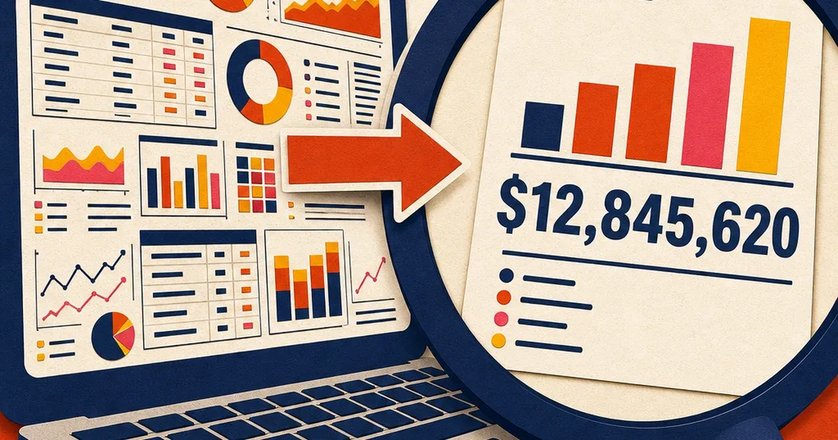
Your product is the ad. That is the SaaS marketer's shortcut, and most of the time it is the right one. Nobody wants a stock photo of a laptop when they could show the actual dashboard doing the actual thing. The problem shows up the moment that screenshot leaves your 27-inch monitor and lands on a phone screen inside a 1080x1080 Facebook frame. The chart axis labels disappear. The button copy turns into a gray smear. The one metric you wanted someone to notice is now competing with eleven other UI elements at a size nobody can read.
This is not a resolution problem. Your screenshot can be perfectly sharp, full 4K, zero compression artifacts, and still be unreadable in an ad, because the text was never designed to be read at ad size. A dashboard built for a 1440-pixel-wide browser window has labels and numbers sized for that context. Shrink the whole thing down to fit a phone feed and every piece of text shrinks with it, well past the point where a thumb-scrolling user can glance at it and understand anything.
Why just taking a screenshot quietly fails
Ad platforms will not reject a dense screenshot the way they might flag a blurry photo. Nothing bounces back with an error. What happens instead is slower and more expensive: nobody stops scrolling, because nobody can tell what they are looking at in the half-second they give your creative before moving on.
Nielsen Norman Group's research on glanceable typography backs this up directly. In a controlled study using lexical-decision tasks, how fast someone can recognize a string as a real word, larger text, wider non-condensed letterforms, and bigger sizing all reliably beat smaller, narrower, more compressed text at speed of recognition, with lowercase at small sizes taking measurably longer to read accurately than larger text (Nielsen Norman Group, "Typography for Glanceable Reading," accessed 2026). A social feed is exactly this kind of glance environment. Users are not sitting down to study your product screenshot. They are deciding in under a second whether to keep scrolling, and a dashboard crammed with a dozen small-type UI elements gives their eyes nothing to grab onto.
NN/g's broader legibility research frames the same idea as a cost-benefit trade a reader makes without thinking about it: if the cost of parsing your content, in this case squinting at tiny chart labels, outweighs the perceived benefit, they disengage before they ever get to the benefit (Nielsen Norman Group, "Legibility, Readability, and Comprehension," accessed 2026). Your dashboard screenshot is not failing because it looks unprofessional. It is failing the reader's glance-test before your headline even gets read.
The fix is not zoom in more, it is picking one hero moment
The instinct when a screenshot reads as too busy is to crop in tighter on the whole dashboard. That helps a little and usually is not enough, because a tighter crop of a busy UI is still a busy UI, just bigger. The fix that actually works is structural: isolate one hero element the ad is supposed to sell, a single stat card, one chart with one clear trend line, one before/after toggle, and rebuild the ad around that element at a size where its text is comfortably legible, with everything else either cropped out or pushed into soft, out-of-focus background context.
Here is the walkthrough with Coinis Ad Studio's tools, not a vague clean it up gesture.
Step 1. Start from a real screenshot, not a mockup. A dense SaaS analytics dashboard with a sidebar nav, four small stat tiles, a line chart with axis labels, and a data table below it mirrors what most SaaS teams actually have sitting in their own product, not a designed marketing asset.
Step 2. Isolate and enlarge, don't just crop. Ad Studio's repair layer, enhance_asset_proxy, run with the recraft-inpaint model, masked tightly around everything outside the one hero stat card, sidebar, header nav, secondary tiles, table, with a fix prompt describing only the target state: a single clean metric card, centered, generously sized, the surrounding interface simplified to soft out-of-focus color blocks, no additional readable text elements. The prompt never names a specific hue or literal defect word, only the desired end state, and the mask stays tight to the region being changed rather than a full-frame rewrite that risks confabulating a different dashboard entirely.
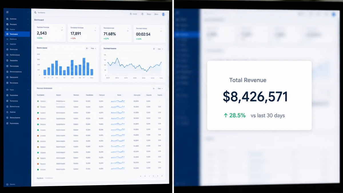
Illustrative example. Two live attempts at this exact inpaint step confabulated garbled fake numbers and mismatched fonts instead of cleanly simplifying the periphery, a known failure mode on busy, text-dense source images. Rather than ship a broken render, the image above is an illustrative substitute showing the target outcome this workflow produces. For a real enhance_asset_proxy correction on a live product photo, see the AI photo enhancer for ads walkthrough.
Step 3. Fan the corrected panel out to every format with generate_image_templates, one call per output format, square for Feed, story for Stories and Reels, landscape for the display network, all built from the same corrected hero-panel source so brand and message stay consistent across every placement instead of three different half-thought-out crops.
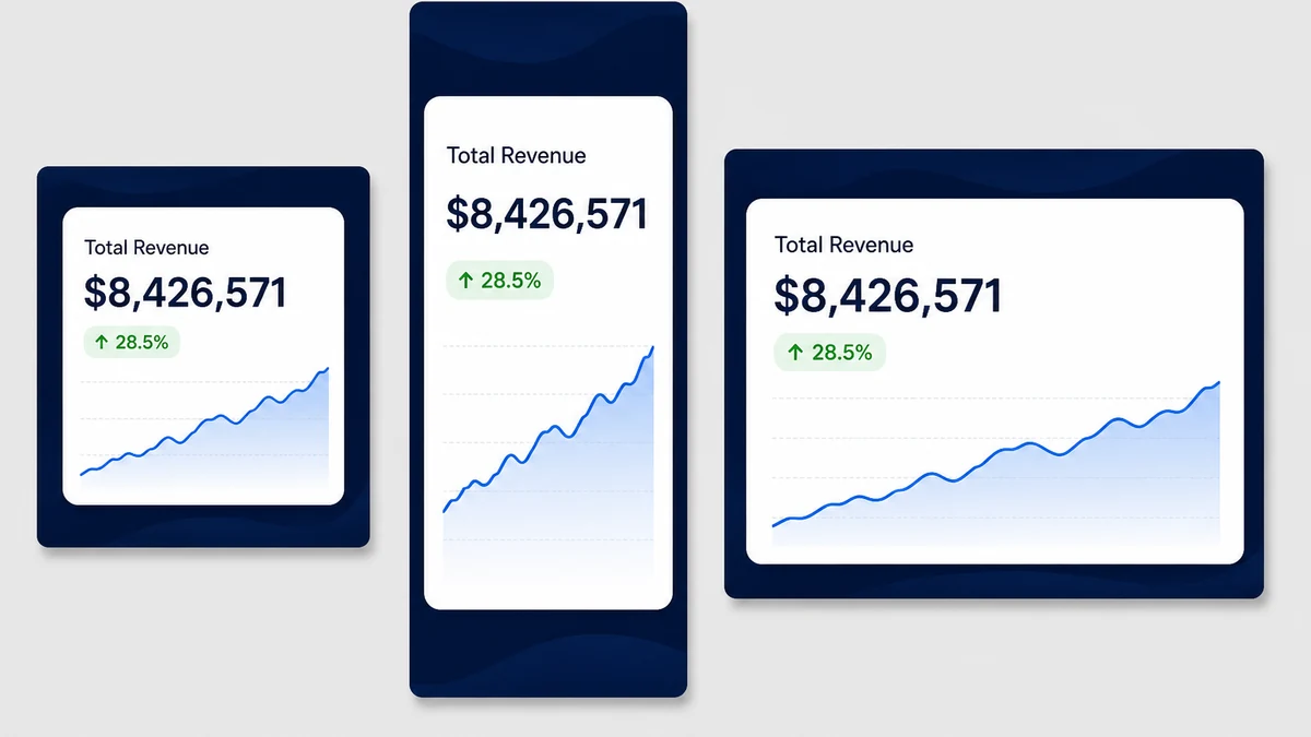
The output is a creative where the one number or trend line you actually want someone to register is the biggest thing on the screen, at every size Meta, Google, or LinkedIn will actually serve it at.
What to isolate when your dashboard has ten things worth showing
Every SaaS product has multiple features worth bragging about, and the temptation is to cram two or three into one ad so nobody misses anything. Resist it. One ad, one hero element. A few reliable choices, in order of how well they tend to read at small sizes.
A single before/after number (14 hours to 40 minutes) reads instantly even shrunk down, because it is two big numbers and almost no supporting text. A single trend line with one annotation, up 3x since Q1, works nearly as well. A table with six rows and four columns of small text is the worst possible choice for an ad, no matter how impressive the data in it actually is. If the thing you are proudest of in your product lives inside a dense table, pull just the one cell that tells the story and build the ad around that instead.
Build it once, run it everywhere
The corrected hero-panel image from Step 2 is also the natural source for an AI ad copy generator that reads your own landing page to write the headline and primary text around it, for ten fresh creative variations once you know which hero metric is actually converting, and for turning that one photo into every ad size the moment your campaign calendar demands a new placement. If your screenshot's real problem turns out to be resolution rather than clutter, the AI image upscaler for ads walkthrough covers that separate failure mode. And if you don't have a metric-driven UI shot to work from yet, a brand awareness ad with no product attached is a legitimate way to run creative before your dashboard has a hero number worth isolating.
Every one of these lives inside Coinis Ad Studio's growing set of SaaS-specific ad tools, built to turn what you already have in your product into ads sized for wherever you're running them, without a design team standing between your dashboard and your next campaign.
Start with the one screenshot that convinced you the product was worth building in the first place. Isolate the one number that proves it. Fan it out to every size. That's the whole workflow, and it fits in the time it used to take to crop one image badly.
FAQ
Does a screenshot ad need to be pixel-accurate to my actual product UI? No, and trying to be perfectly accurate is usually what causes the legibility problem in the first place. An ad is not a product tour. It is a promise about one outcome, rendered in a format your actual UI was never designed to be read at. Simplify aggressively, then link the accurate detail to your landing page where a reader who clicked has time to look closely.
Will Meta or Google actually reject a dense screenshot for having too much text? Not usually outright, but both platforms factor text density and image quality into ad-strength or serving-eligibility scoring behind the scenes, and neither will tell you exactly why a creative underperforms. The practical effect is the same as a rejection: your CTR quietly suffers next to a cleaner creative, with no error message pointing at the cause.
Should I redesign the dashboard screenshot with a designer instead of an AI tool? Either works if you have design time to spare, but the AI pipeline described here takes a screenshot you already have and produces all three ad formats from the same source in minutes, which matters more the more often you are shipping new feature announcements or A/B test variants.
Does this replace real product screenshots on my landing page? No. Landing pages are a different reading context where someone chose to look closely, so full dashboard detail belongs there. Ad creative is a glance-speed decision, and the two should not use the identical asset.
What if my product genuinely doesn't have one clean hero metric to isolate? Most SaaS products have at least one number that moved because of the product, time saved, revenue recovered, error rate dropped. If nothing in the product surfaces that cleanly, the ad's job might be better served by a customer quote or a before/after workflow comparison instead of a raw UI screenshot at all.
Sources
- Nielsen Norman Group, "Typography for Glanceable Reading: Bigger Is Better" (accessed 2026): https://www.nngroup.com/articles/glanceable-fonts/
- Nielsen Norman Group, "Legibility, Readability, and Comprehension: Making Users Read Your Words" (accessed 2026): https://www.nngroup.com/articles/legibility-readability-comprehension/

Isidora Matovic
Author
Social media enthusiast and a full time researcher. She takes digital presence very seriously and that is why you are always in touch in what is going on with us! Follow us for more posts like this.