
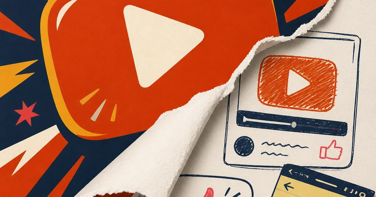
For years, the advice was the same: shoot clean, light it well, keep the brand consistent, follow the platform's own creative specs. Then 2026 happened, and a lot of advertisers noticed their scrappiest, least "on-brand" creative was quietly beating the polished stuff.
It has a name now: ugly ads, a flavor of native advertising built for the feed itself. Grainy phone footage. A fake Notes app screenshot. A text bubble that looks like a real comment, not an ad unit. None of it looks like something a brand paid an agency to make, and that's exactly the point.
Ad Studio's generate_image_preset_agent now ships an ugly-ad preset built for this specific style. It takes a normal product photo and deliberately composes it into something that looks native, interrupted, and almost accidental, the visual opposite of a studio shot, on purpose.
Why polish stopped working
Platforms reward ads that don't look like ads, and they've been saying so directly for years. TikTok's own "Don't Make Ads. Make TikToks" campaign, first launched in 2021 and still the platform's standing creative philosophy, exists because studio-grade creative reads as an interruption the moment it hits a feed built on native, sound-on, full-screen content. TikTok's own Spark Ads documentation cites a Nielsen-commissioned authenticity study and reports that 52 percent of internet users want brands to be authentic and 84 percent of people say they've been convinced to buy something after watching a branded video that felt native rather than produced.
Meta has moved the same direction from its side. The company's December 2025 announcement of new AI-powered creator-partnership tools reported that adding Partnership Ads, campaigns built around creator content rather than studio production, alongside standard brand ads delivered 19 percent lower cost per acquisition and 13 percent higher click-through rate across roughly 2,400 advertisers tested. That's not a marginal lift. It's a platform telling advertisers, with its own measured data, that the less-polished format is winning the efficiency argument.
Search Engine Land's April 2026 piece on the trend put the mechanism plainly: "High-production ads signal 'this is an ad' almost instantly, triggering a skip reflex before your hook lands." A clean product shot with studio lighting is the single fastest way to get a thumb to keep scrolling. A grainy screenshot or a comment-bubble format buys an extra half-second before the brain files it as marketing, and that half-second is often the whole game.
What the ugly-ad preset actually does
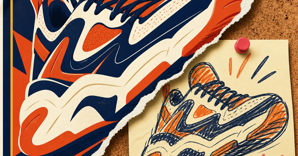
generate_image_preset_agent's ugly-ad preset takes a product photo and a brief, then composes it the way a cold-traffic-tested lo-fi ad actually looks: flattened contrast, a native-feeling crop, text that reads like a screenshot caption or a comment bubble rather than a designed headline, none of the polish cues (drop shadows, gradient backgrounds, centered hero shots) that signal "this was made by a creative team."
That's a different job from the preset's siblings. The product-hero and editorial presets in the same tool build clean, considered compositions. The ugly-ad preset is built to look like the opposite of considered, while still keeping the product recognizable and the message legible. The craft is in making something look accidental on purpose, which is harder to pull off by hand than it sounds: a genuinely bad photo just looks bad, while a deliberately rough ad still has to land the hook and the offer.
It also sits in a different lane from Ad Studio's other native-feeling formats. Street interview ads and POV-style ads get their native feel from an unscripted performance, a real voice talking to camera. A UGC-style testimonial built from a screen recording gets it from a creator's delivery. The ugly-ad preset gets the same effect from a static image alone, no performance required, just a product photo stripped of its polish cues.
Worked example: a clean product photo, deliberately roughed up
Take a standard, well-lit product shot, the kind most catalogs already have on hand. The brief for the preset:
Preset: ugly-ad
Product: [product photo URL or productId]
Style direction: native screenshot/notes-app feel, flattened contrast, no studio lighting cues, text treated like an overlay comment or caption rather than a designed headline
Message: one short, specific line (a real product detail or a plainspoken claim), not brand copy
Avoid: gradients, drop shadows, centered hero composition, polished typography
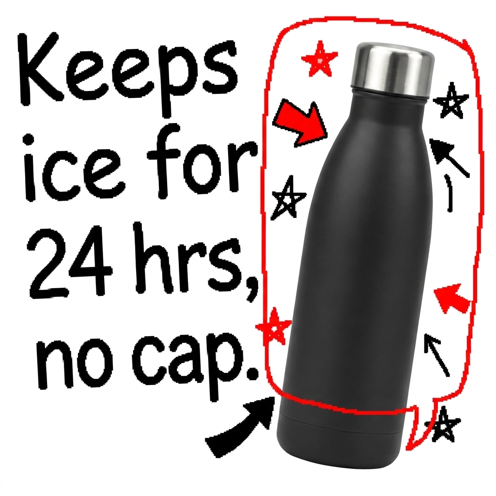
What comes back should look like something a customer might screenshot and send a friend, not something a brand paid to produce, while the product and the message still land clearly.
The 80/20 rule: don't throw out the polished creative
This isn't an argument for abandoning clean product photography. Search Engine Land's reporting on the trend is explicit about this: keep roughly 80 percent of spend on proven, polished creative, and use the remaining 20 percent to test lo-fi formats like this one. Ugly ads tend to win on cold-traffic hook rate and click-through, the moment someone decides whether to keep scrolling. Polished creative still earns its keep on retargeting, where the audience already knows the brand and a clean, confident shot closes the sale instead of just stopping the scroll.
The honest failure mode is faking the roughness without the substance behind it. A deliberately lo-fi ad that doesn't follow through with a real, specific claim doesn't become credible just because it looks native. The format buys attention. What's actually said in that extra half-second still has to be true and worth reading.
FAQ
Is this just a lower-effort version of a product ad? No, it's a different attention mechanism, not a shortcut. A genuinely bad photo doesn't work the same way a deliberately composed low-polish ad does, the preset's job is making the latter, not the former.
Will this preset work for every product category? It works best for categories where a cold-scroll audience has learned to tune out studio creative, which by 2026 is most consumer categories on Meta and TikTok. High-ticket or trust-sensitive categories (financial products, medical devices) should lean more heavily toward the 80 percent polished side of the split.
How do I know if it's working? Test it the way the trend coverage recommends: run it against your current best polished creative in the same ad set, same audience, same budget, and compare cost per click and click-through rate, not just impressions.
Does "ugly" mean low quality? No. The preset still needs a legible product and a real message. "Ugly" describes the visual register (native, unpolished, screenshot-like), not a drop in craft or honesty.
Try it on Coinis
Pick your cleanest, most "ad-looking" creative and make a deliberately rougher version to test against it. The scroll doesn't reward polish anymore. It rewards whatever doesn't look like it's trying.
Start building ugly-ad creative on Coinis
Sources
- Search Engine Land, "Why ugly ads outperform polished creative and how to test them" (Akvile DeFazio, April 22, 2026): https://searchengineland.com/ugly-ads-outperforming-polished-creative-475007
- TikTok For Business Blog, "What we mean when we say 'Don't Make Ads'": https://ads.tiktok.com/business/en-US/blog/what-we-mean-when-we-say-dont-make-ads
- TikTok For Business Blog, "Spark Ads 101: Make TikTok videos into ads" (84% convinced-to-buy, 52% want brand authenticity, Nielsen-commissioned authenticity study citation): https://ads.tiktok.com/business/en-US/blog/spark-ads-101-make-tiktoks-into-ads
- Meta for Business, "New AI-powered tools to scale creator and brand partnerships" (19% lower CPA, 13% higher CTR, ~2,400 advertisers, December 11, 2025): https://www.facebook.com/business/news/new-ai-powered-tools-to-scale-creator-and-brand-partnerships

Isidora Matovic
Author
Social media enthusiast and a full time researcher. She takes digital presence very seriously and that is why you are always in touch in what is going on with us! Follow us for more posts like this.