

A paint retailer photographs a wall of color chips under even, professional studio lighting, color-matches the shot carefully against the physical swatches on the table, and ships the images to the product catalog and the ad campaign. A customer orders the color online, paints a wall, and calls to complain it's the wrong shade. Nothing in the photography process was done wrong. The paint itself is the problem, and it is a problem no amount of careful studio lighting can fix.
Why two correctly-lit photos of the same swatch can still mismatch
Paint pigments and dyes are mixed from different combinations of colorants to hit a target shade, and two swatches can be formulated completely differently while still looking identical under one specific light source. This is called metamerism, and when the match breaks down under a different light source, color scientists call it illuminant metameric failure, a well-documented phenomenon in colorimetry where two material samples match under one light but visibly diverge under another (Wikipedia, "Metamerism (color)," accessed 2026). A pair of paint chips can look like a perfect match under a camera's studio lighting rig and look like two different colors entirely once a customer views the same paint on their own wall under their living room's LED bulbs or afternoon window light.
The paint industry has dealt with this for decades on the formulation side. X-Rite's own color-science documentation notes that metameric matches are especially common in near-neutral colors like grays, whites, and dark shades, exactly the color families that dominate a typical paint wall display (X-Rite, "What is Metamerism?," accessed 2026). Carboline's technical materials describe the textbook version of this failure directly: two paint samples that appear to match perfectly in daylight look completely different under the fluorescent lights of a paint store, because the two samples have different spectral fingerprints even though they produced the same color sensation under one specific light (Carboline, "Understanding Metamerism: Color Matching for Industrial Coatings," accessed 2026). A product photo is just one more light source in that chain, and it has no obligation to agree with a customer's kitchen.
What a mismatched swatch photo costs a paint retailer
Color accuracy research outside the paint category backs up how directly this hits the bottom line. Nearly 11% of online shoppers report they would return a product specifically because of color inaccuracy, and 58% say they would not purchase from the same retailer again after experiencing a color inconsistency between the product shown and the product received (Pixelz, citing European Journal of Marketing research, accessed 2026). Paint is a category where that mismatch is unusually expensive to walk back. A shopper who orders the wrong gray doesn't just return a box, they've likely already opened a can, cut in a wall, and burned a weekend before discovering the problem.
The category itself is sizable enough that this isn't a niche concern. IBISWorld puts the Paint Stores industry in the US at $18.0 billion in 2026 across 4,244 businesses (IBISWorld, "Paint Stores in the US," 2026), with the online-specific slice, Online Paint Sales, alone worth $6.7 billion (IBISWorld, "Online Paint Sales in the US," 2026). Every one of those online transactions is a customer deciding to trust a color they can only see on a screen, lit by whatever light source the retailer's photographer used that day.
Fix the swatch photo against a verified reference, not against the room it was shot in
Ad Studio's repair layer, enhance_asset_proxy, handles exactly this kind of color correction without a reshoot. One tool covers upscaling, sharpening, denoising, lighting and white-balance fixes, background swaps, and masked inpainting, selected through a single model field matched to the flaw on the photo.
A metameric color mismatch sits across the entire swatch surface, not in one isolated spot, so the correction that fits is a full-frame recraft-inpaint pass: a mask covering the whole color chip, paired with a prompt describing the swatch corrected to match its verified manufacturer color reference, consistent texture and finish preserved, rather than a prompt that chases whatever shade the studio lighting happened to produce.
Per the standing lesson from this pipeline's own prior color-correction work, the prompt never names the specific hue the camera got wrong. It describes only the target state, the verified reference color, rather than instructing the model to "fix the gray" or "remove the blue tint," because naming a color in a defect-repair prompt risks the model reading it as a design instruction instead of a correction target.
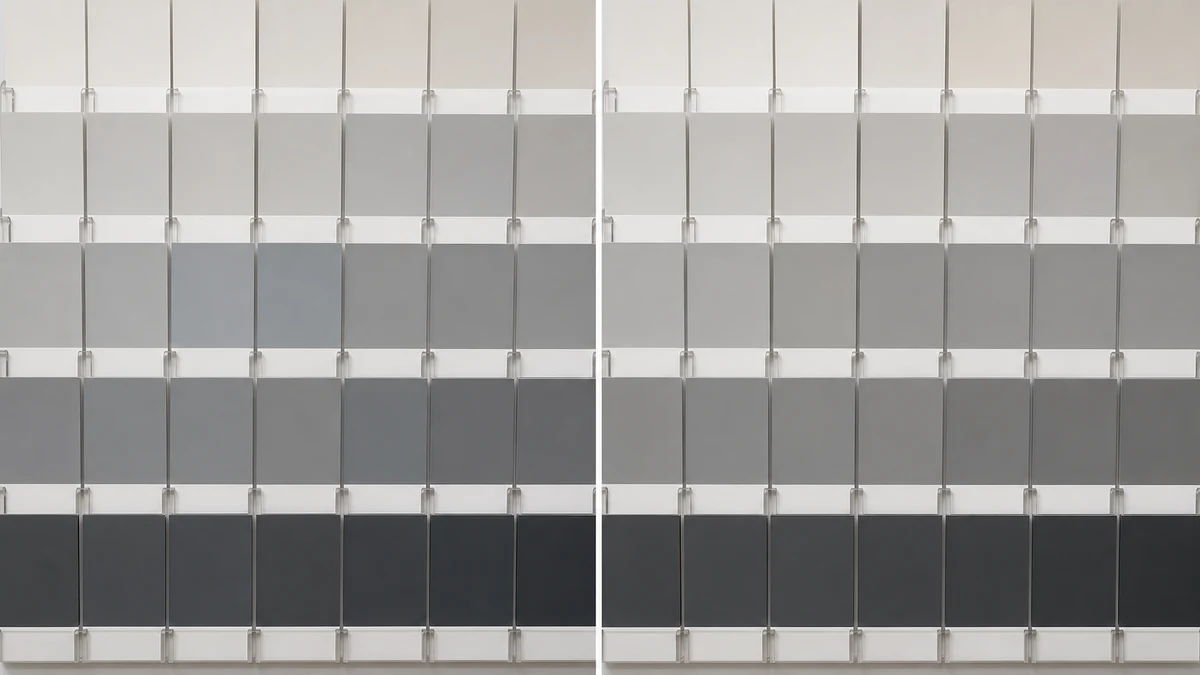
mcp.coinis.dev's Ad Studio connection is in an extended outage as this article publishes, so the image above is an illustrative mockup rather than a live enhance_asset_proxy render. For a real enhance_asset_proxy recraft-inpaint color repair, see the fishing tackle photo purple-fringe fix article, which shows the tool's actual output.
Once every swatch reads true to its reference color, the fan-out step is generate_image_templates, Ad Studio's primary image-ad generator. One corrected catalog photo becomes a square feed post, a 9:16 Story, and a horizontal Display banner in a single pass, without rebooking a studio session for every platform's own size spec.

Why this keeps resurfacing across a paint retailer's catalog
A paint brand doesn't photograph one swatch wall once and move on. New colorways launch on a seasonal cycle, color chip displays get reshot for refreshed catalogs, and every single shoot reintroduces the same spectral mismatch between whatever light source lit the studio and whatever light source eventually lands on a customer's wall. The order that holds up: correct each swatch photo against its own verified reference color first with enhance_asset_proxy, confirm labels and finish are untouched, then hand the corrected file to generate_image_templates for the size fan-out. Resizing a metamerism-shifted photo before correcting it just multiplies the same mismatch across every ad placement instead of resolving it once.
This is the same underlying pattern already proven across other optically sensitive product categories on this blog: a hotel's mixed-lighting color cast across a single room photo and a beauty brand's whole-photo white-balance color cast are both versions of the same lesson applied to the paint and home-improvement retail space: a color-accuracy failure has a specific, citable physical cause, and the fix has to target that exact mechanism rather than a generic color-grade pass. It is distinct from both of those cases because the paint swatch mismatch isn't a sensor limitation or a lighting miscalibration at all, it's a property of the pigment formulation itself interacting with whichever light source happens to be in the room.
FAQ
Is this a camera problem or a lighting problem? Neither, directly. The camera and studio lighting can be perfectly calibrated and the mismatch still happens, because the paint samples themselves are formulated from different colorant combinations that only agree under one specific light source. This is a property of the pigments, not a capture error.
Does switching to daylight-balanced studio bulbs fix it? Not reliably on its own. It can reduce the mismatch for that one lighting setup, but it doesn't guarantee the photo will still match once the paint is viewed under a customer's own home lighting, which is an entirely different light source the studio has no control over.
Will this show up on every paint color in a catalog? No. Metameric failure is most pronounced in near-neutral colors (grays, whites, off-whites, and dark shades), which happen to be some of the most commonly stocked colors in a typical paint retailer's catalog. Bright, highly saturated colors are less prone to this specific failure mode.
Do I need a separate photo for every ad platform's size spec? No. generate_image_templates crops and composes each platform's spec from one corrected source photo, which is the entire point of fixing the swatch color once instead of re-shooting for every export.
Sources
- Wikipedia, "Metamerism (color)" (accessed 2026): https://en.wikipedia.org/wiki/Metamerism_(color)
- X-Rite, "What is Metamerism?" (accessed 2026): https://www.xrite.com/blog/what-is-metamerism
- Carboline, "Understanding Metamerism: Color Matching for Industrial Coatings" (accessed 2026): https://www.carboline.com/solution-spot/posts/understanding-metamerism-color-matching-for-industrial-coatings/
- Pixelz, "Learn How Accurate Colors Can Reduce Your eCommerce Return Rates" citing European Journal of Marketing research (accessed 2026): https://www.pixelz.com/blog/color-correct-product-photography-reduce-e-commerce-return-rates/
- IBISWorld, "Paint Stores in the US" (2026): https://www.ibisworld.com/united-states/market-size/paint-stores/1032/
- IBISWorld, "Online Paint Sales in the US" (2026): https://www.ibisworld.com/united-states/market-size/online-paint-sales/5435/

Isidora Matovic
Author
Social media enthusiast and a full time researcher. She takes digital presence very seriously and that is why you are always in touch in what is going on with us! Follow us for more posts like this.